
01. DISCOVER
What are competitors doing right? Wrong?
Conducting competitive analysis allowed us to assess the strengths and weaknesses of WUF's competitors and identify key opportunities to innovate and differentiate.


Key findings:
- 1Competitors did not take into account mixed breeds, disabilities, or special health requirements when generating activity goals.
- 2Competitors did not track activity intensity such a low, moderate, high intensity.
- 3. Competitors summarized activity data in bar and line graphs and did not provide a written interpretation of the data.
- 4. Competitors did not address mental exercise and its importance to a dog's overall health.
What do the users think?
10 interviews + 90 surveys + 100 card sort
In order to solve real problems, we needed to listen to real users. Obtaining user insight allowed us to get into the minds of users and advocate their needs. Our goal was to determine if there was a need to monitor a dog’s activity and any predictable pain points.
Here is what users said...

“I am never sure how much exercise my dog should get. Is it too much or not enough?"

“It's not like my dog is overweight, I am just curious how a 30 min walk compares to a 15 minute sprint.”

“I don’t care about the details of my dog’s activity. I do care about the overall health of my dog.”
02. DEFINE
What are the KEY problems our users are experiencing?
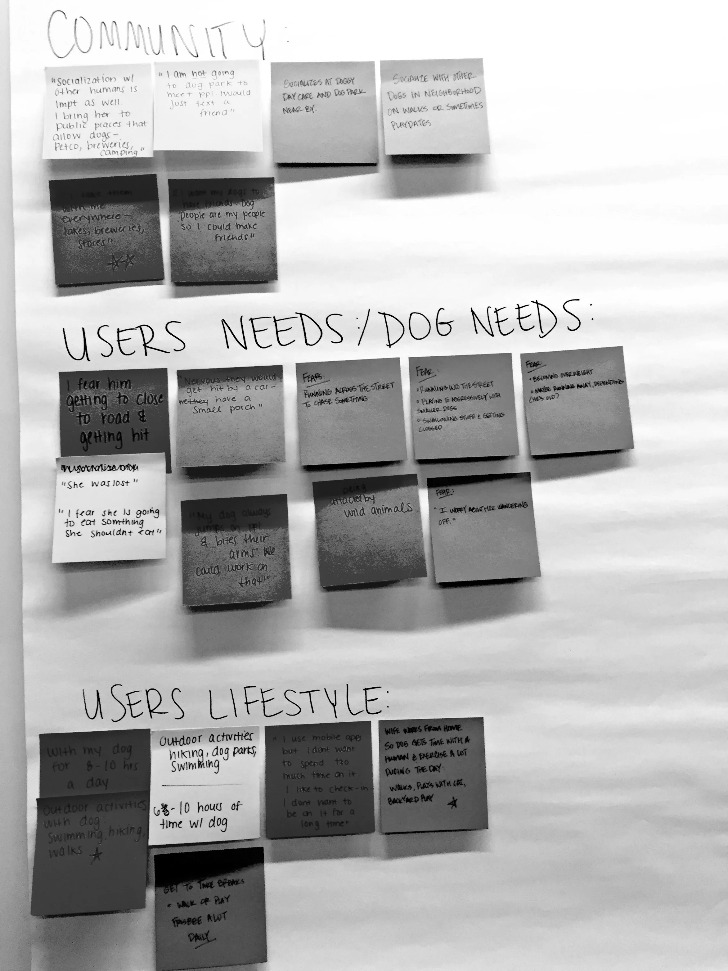
We took all of the messy data from our research and organized it into an affinity diagram. Affinity diagrams allowed us to sort through the data and identify key problems our users were experiencing.


Here are the consistent problems we found:
Understand Goals
Users need a better way to understand their dog’s activity and sleep needs.
Stay Updated
Users need a better way to stay updated and informed of their dog’s activity and sleep progress.
Improve Health
Users need a better way to explore new ways to help improve the dog’s overall health.
Who are the ideal users experiencing these problems?
We created Ryan Grizzly and Brittany Bozeman, our personas that represent the ideal user. By creating personas, we were able to make intentional, user-centered, and unbiased design decisions throughout the entire process. .


03. DEVELOP
How can we design an app that will solve our user's problems?
We individually brainstormed as many possible ways to design an app that support our persona's needs and solve their problems.


Will it make sense to our users?
Prototype + Test + Iterate
(Version 1)
We developed multiple paper prototypes from a variety of concepts that we had developed during our ideation process. We found that rapidly generating paper prototypes were the most efficient way to test out new concepts with users and quickly iterate our designs. Here are three screens from our first prototype.
Activity (Day View)
Sleep (Week View)
Explore Exercises
What we learned...
- Users had a difficult time identifying the activity/sleep toggle
- Users expressed that the percentage of goals hit in the last week was not as important as the average amount of sleep per night.
- Users felt that the weekly sleep breakdown was useful and easy to understand but was lost at the bottom of the page.
- Users were more likely to select mental stimulation exercises (such as nose work & hide-n-seek) vs. physical exercises.
What we changed...
- At first, I placed the activity/sleep toggle at the top of the page below the tab bar, but it looked cluttered. To clean it up, I converted the hour/day/week/month tab bar into a history button/ slide up action sheet.
- Displayed the weekly average time in the progress circle vs. the percentage of goals hit.
- Created a wheel/bar toggle button in order for users to easily navigate between the graph and wheel view.
- Revised the exercise suggestions categories to reflect unique and creative mental and physical games.
Sweet! Will it make sense to our users now?
Prototype + Test + Iterate
(Version 2)
After making iterations from our first prototype, we tested our second paper prototype with users in order to generate feedback on the new changes. We intentionally did not build wireframes at this point because we did not have enough data to confidently support our prototype design.
Activity (Day View)
Sleep (Week View)
Explore Exercises
What we learned...
- Users had a difficult time identifying the function of the icon buttons.
- Users felt that the number of times the dog woke up throughout the night was not important.
- Users had a difficult time predicting what they would see if they were to select an exercise category.
What we changed...
- Changed the icons on the button to words in order to clarify their function.
- Provided users with the duration of time that the dog was awake in order to better differentiate movements in sleep vs. being awake.
- Displayed exercises examples within each category.
How can we make the experience even better?
This process of designing, testing, and iterating continued until we established our final prototype...
04. DELIVER
High Fidelity Prototype
We applied product branding, grid structure, typography, color scheme, and icons to develop a high fidelity prototype. We made it interactive with tools like Sketch and Invision. This allowed the team to easily distribute and observe exactly how well the app would function before it gets developed.
Click through the prototype below!
Detailed Annotations
Creating detailed annotations of our prototype allowed us to better articulate how the mobile app works and help explain the rationale behind each design decision.