THE CHALLENGE
Strengthen the connection between
donors and their cause
Our challenge was to design a mobile app for Care.org that would provide an innovate way to entice users to stay connected to their cause through consistent engagement and ongoing donations.
THE SOLUTION
See the Impact
Users can stay updated on their cause’s progress by accessing inspiring videos, articles, and podcasts on their personalized newsfeed.
Stay in the Loop
Users can follow the cause story by staying up to date on the donation budget and learning about how the donations are used.
Feel Inspired
Users can explore new causes to help through a customized newsfeed relating to the user's selected interests.
THE STORY
My Role: UX Lead
Role: I was fully responsible for information architecture, UI design, visual design, and project management
Team: Sam (User Researcher), Jen (Usability Testing)
Timeline: 10 days
Tools: Sketch, Invision, Keynote
01. DISCOVER
What makes Care.org unique?
Competitive Analysis
All good products have competitors. Conducting competitive analysis allowed us to assess the strengths and weaknesses of competitors and identify opportunities to innovate and differentiate.
What we learned
1
Competitors focused marketing efforts on the need for donations vs. impact of donations.
2
There was very little donation assurance or follow up aside from an email confirmation from the organization.
3
Competitors were not allowing users to specify which project their donation went to.
Interviews
In order to solve real problems, we needed to listen to real users
Interviewing users allowed us to get into the minds of our users and advocate their needs while balancing business goals and brand values.
Here is what users said...
“I love hearing from the recipients of my donation and seeing that it has made an impact. It inspires me to continue to help.”
“I stopped donating because I never received any updates of the cause progress. Out of sight, out of mind.”
“I like seeing options when I donate. I tend to donate to places I have been, people I have met, or issues I am most passionate about.”
02. DEFINE
What are the key problems our users are experiencing?
Affinity Diagrams
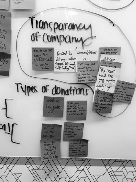
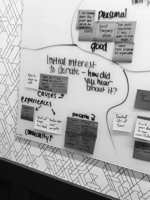
We took all of the messy data from our research and organized it into an affinity diagram. Creating affinity diagrams allowed us to identify key problems our users are experiencing.
Here are the consistent problems we found
Users need a better way to...
Feel Impactful
Know that their donation had actually made a difference
Stay Connected
Stay connected to the cause and informed
Feel Inspired
Explore new ways to help
Personas
So, who are the ideal users experiencing these problems?
Reed Hastings and Annie Matthews are two personas we developed in order to visualize our ideal users. By creating these personas, we were able to design an app that would solve their problems. It helped us stay focused and unbiased throughout the entire design process.
User Flows
How would our personas use this app to solve their problem?
Now we needed to visualize how our personas would with the app. User flows are driven interactions that allowed us to map out the path that users may take to complete a task. This helped identify elements of the app and establish interaction flow.
03. DEVELOP
Paper Prototype + Test + Iterate
Paper prototypes are the most efficient way to test out concepts in a quick and inexpensive way! Developing several paper prototypes allowed us to determine which designs worked and didn't work. More importantly, it allowed us to rapidly iterate our designs based upon user feedback.
Homepage
Cause Page
Explore Page
What we learned...
- Users identified that the "donate now" button was lost at the bottom of the page.
- Users felt that the content newsfeed was very valuable but difficult to find.
- Users were confused by what the dots on the process bar meant.
- Users felt that the title and subheading was not enough information for them to want to select the new cause to view more.
What we changed...
- Removed the donation button and added it to the navigation bar for fixed, quick access.
- Replaced the homepage with a newsfeed of cause updates relating specifically to user's causes.
- Simplified the progress bar by removing dots in order to make the bar more understandable.
- Created an entirely separate newsfeed relating to new cause content that users may explore.
Wireframes + Test + Iterate
After making iterations from our first prototype, we developed a low fidelity prototype in order to quickly communicate abstract concepts and generate feedback. Greyscale wireframes allowed us to test concept vs. appearance (and save time!).
Homepage
Cause Page
Explore Page
What we learned...
- User found the "My Causes" title misleading and confusing
- Users did not interact with the action bar until after they clicked on content
- Users felt that the scope of the live progress statistics was too broad to see a daily change
- Users were curious who else donated to the cause aside from peers
- Users had a difficult time navigating to the explore page
What we changed...
- Change the title to the name of the cause and differentiate causes by color
- Move action bar to article page where it was more applicable.
- Remove progress statistics and add a link to view more details on the cause page of the care.org website in order to better utilize screen real estate.
- Indicate celebrities who have donated to the cause in addition to peers.
- Add a toggle bar to the homepage to allow users to quickly change between the cause newsfeed and explore cause newsfeed.
This process of designing, testing, and iterating continued until we established our final prototype...
04. DELIVER
High Fidelity Prototype
We applied product branding, grid structure, typography, color scheme, and icons to develop a high fidelity prototype. We made it interactive with tools like Sketch and Invision. This allowed the team to easily distribute and observe exactly how well the app would function before it gets developed.
Detailed Annotations
Creating detailed annotations of our prototype allowed us to better articulate how the product works and the rationale behind each design decision.


